Layout Gallery
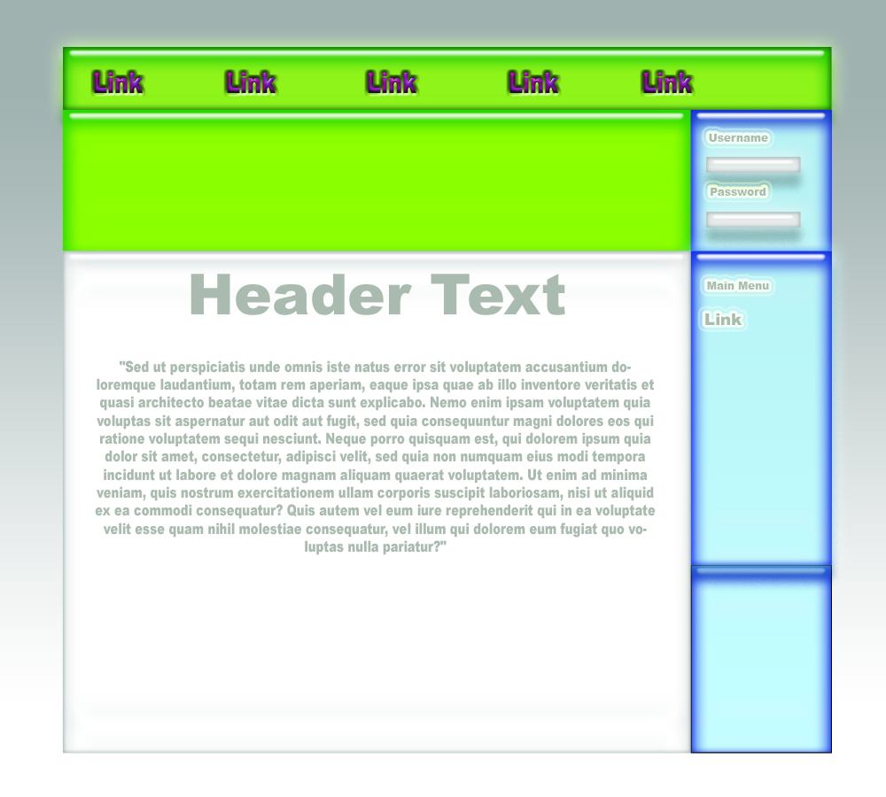
Latitude, designed by AJ, shows a fairly simple site layout that can be used by almost any type of site. It can be modified quite easily to suit a customer's needs. The main banner across the top can be changed replaced by an image that displays the company's logo and name as they display it in advertisements, on letterhead etc. The color scheme can be changed to match the colors used by the company. Even the dimensions of various areas can be changed. Nearly all of the scripts tricks and features shown earlier can be used in this layout.
Neon, designed by Christ, has a more modern look to it. Because of it's more involved visual appearance it would require a few more images than typically desired, however using repeat controls in the stylesheet the size can be cut down dramaticly (dialup users might notice a slight lag, but nothing they're not used to). Because most of the navigation links and header text are images, once a site using this layout is completed for a customer, should they desire any layout changes the process would be more involved than simply altering a few text files. Depending on the the needs of the customer and the possability of future changes, a customer would need to decide if having a more visually involved site is worth having a longer turnaround on future modifications to the site. Most of the perviously displayed scripts could be used with this layout, infact, the Mirage hack would be an absolute must.
Jetsons, designed by Brad and AJ, is not quite production ready. It is capable of accomodating what would be a very busy (busy refers to data density, not site traffic) site, and displaying it in a relativly simple 2 column layout. Some of the artwork still needs work but this may be something that cant easily be done without knowing what the page is actually for. Using the asymetrical 2 column layout there are endless possabilities AJAX data population, PHP driven notifications, or for very large/busy sites even a comprehensive navigation tree or search system. All of the scripts demonstrated before can be used with this layout, however the client should be cautioned that because of the nature of the layout, it should not be over done.
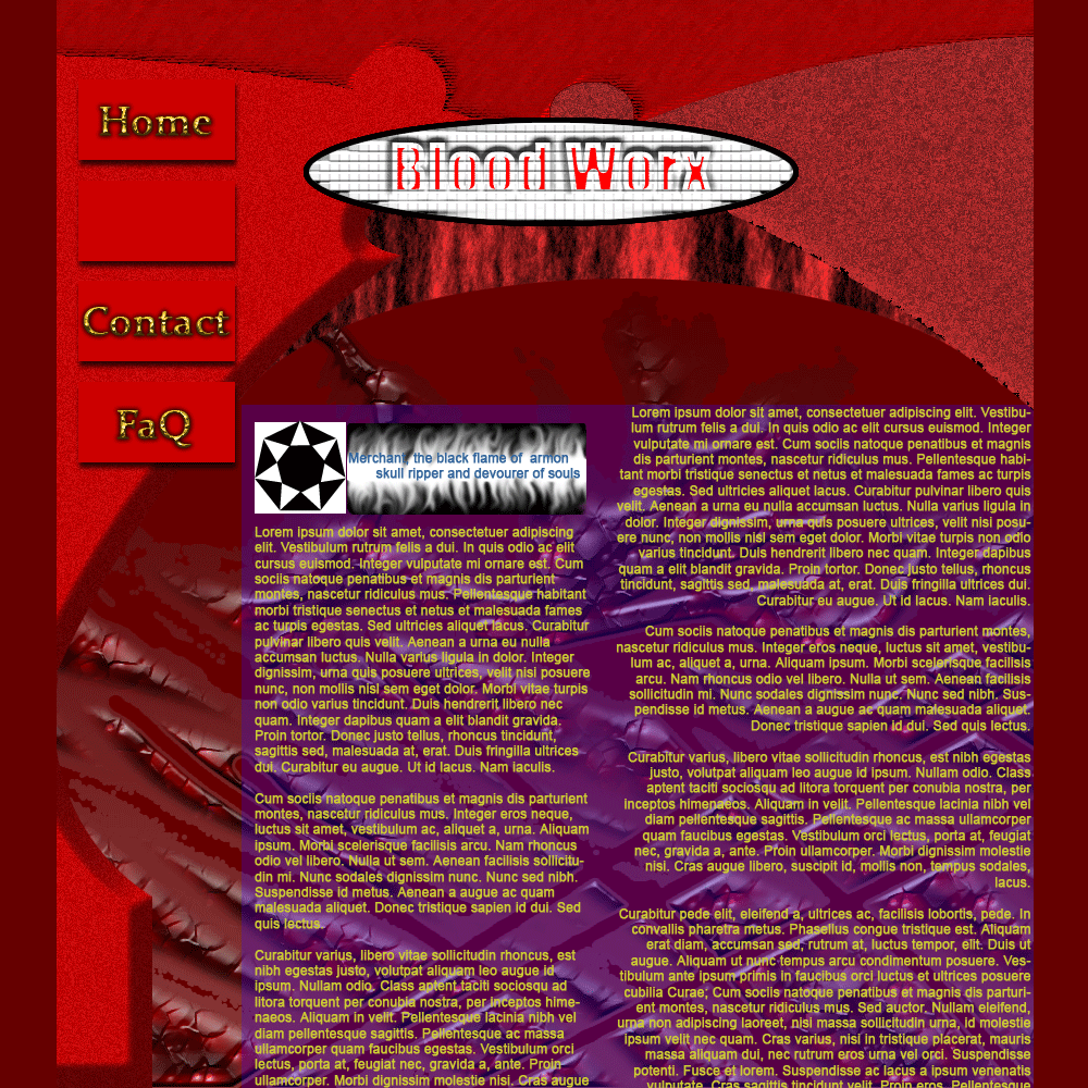
Bloodworx, designed by Brad, is a graphicly loud layout. Not the best choice for many businesses but an ideal layout for a company targeting a young audience (possibly a retailer of video games, RPG books, trading card games, comic books, etc). Because of the graphic involvement, this layout would have a higher load time on slower internet, however, because of the targeted audience this should not be a problem as that demographic will generally be on a high speed internet connection. While most of the previous scripts will work with this layout, it would be suggested to try to keep script involvement fairly low because of the aforementioned slower load times due to filesize.
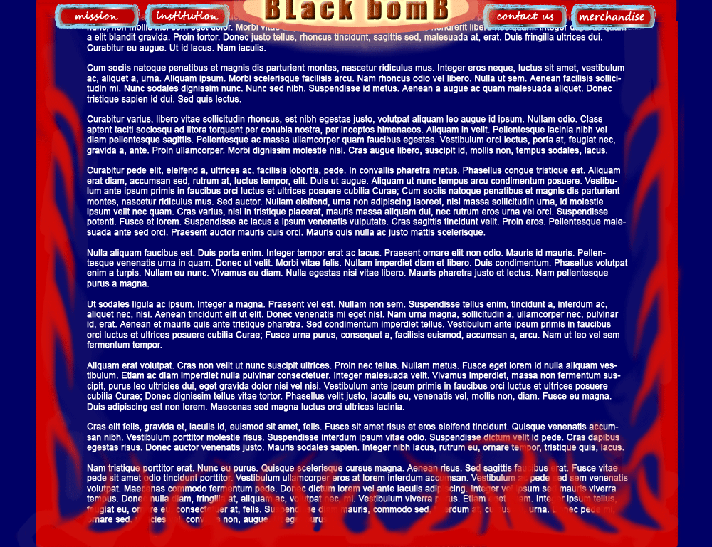
Black Bomb, designed by Brad, is a relativly simple design that can be modified to fit many different needs. The flame boarders could be changed into just about anything. If needed, another row could be added to the top navigation bar. As always teh colors can be modified to meet the needs of the customer. One further advantage of Black Bomb that has not been shown yet is that the main content area is the full width of the site. This creates the possability to do nearly anything with regard to the structure of the content information. Because of the bottom frame image it is undermined at this time if the Slide down and Show/Hide scripts would work with this layout (it may take heavy modifications and quite a bit of testing). However the other scripts shown can be implimented without problems.
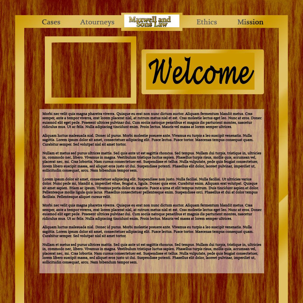
Maxwell, designed by Brad, it is a very simple, elegant layout that (with very little modification/tweaking) can be used as is, or modified to give it a different look and feel. Depending on how the background you see in the image is cut/modified for repetition, the page may load a little slow on dialup (the downside of having a small sample repeating vs. a large sample repeating, is that a small sample often causes a grid pattern to appear, detracting from the wood appearance). While for a more rustic looking layout such as this too much motion or JavaScript interactivity would not be recomended, all of the previous scripts will work with this layout.
Capital, designed by AJ (shown at TenopirAndHuerter.com), is another relativly basic layout that can be tweaked and modified to the clients needs. It allows for many possible 'looks'. All of the scripts, tricks and features you've seen thus far can be used with this layout.
Hatch, designed by AJ (used throughout the portfolio), was introduced and described on the first page you saw. It is a very versatile layout with endless possabilities for future modification. It can (obvously) handle all of the scripts shown in this portfilio.
The scripts, tricks and features shown in this portfolio are by no means a limitation to what can be done with the various languages and techniques described. There are many other lesser scripts frequently used that were probably overlooked durring the compiling of this portfolio. While meeting with clients and discussing what they want for the site, the advantages, disadvantages, powers, and limitations of scripting in relation to the clients ideas will be covered so that an informed decision and workable solution can be reached.
On the next page you will find the process used in the creation of a new web page.